Start with the light of Grasse
The light in Grasse is never uniform. In the morning it arrives soft and slightly blue. By midday it turns clear and warm, then it goes golden in the late afternoon. A kitchen that ignores this movement looks flat. We look first at how the windows face and how the sun travels across the worktops. A room facing south can carry deep tones and dark woods without going gloomy. A kitchen facing north does better staying light, with surfaces that send the light back rather than soak it up. Before we choose a single colour, we spend a day watching how the daylight comes in. That simple reading saves a lot of regret and shapes almost every decision that follows.
A palette drawn from the hills
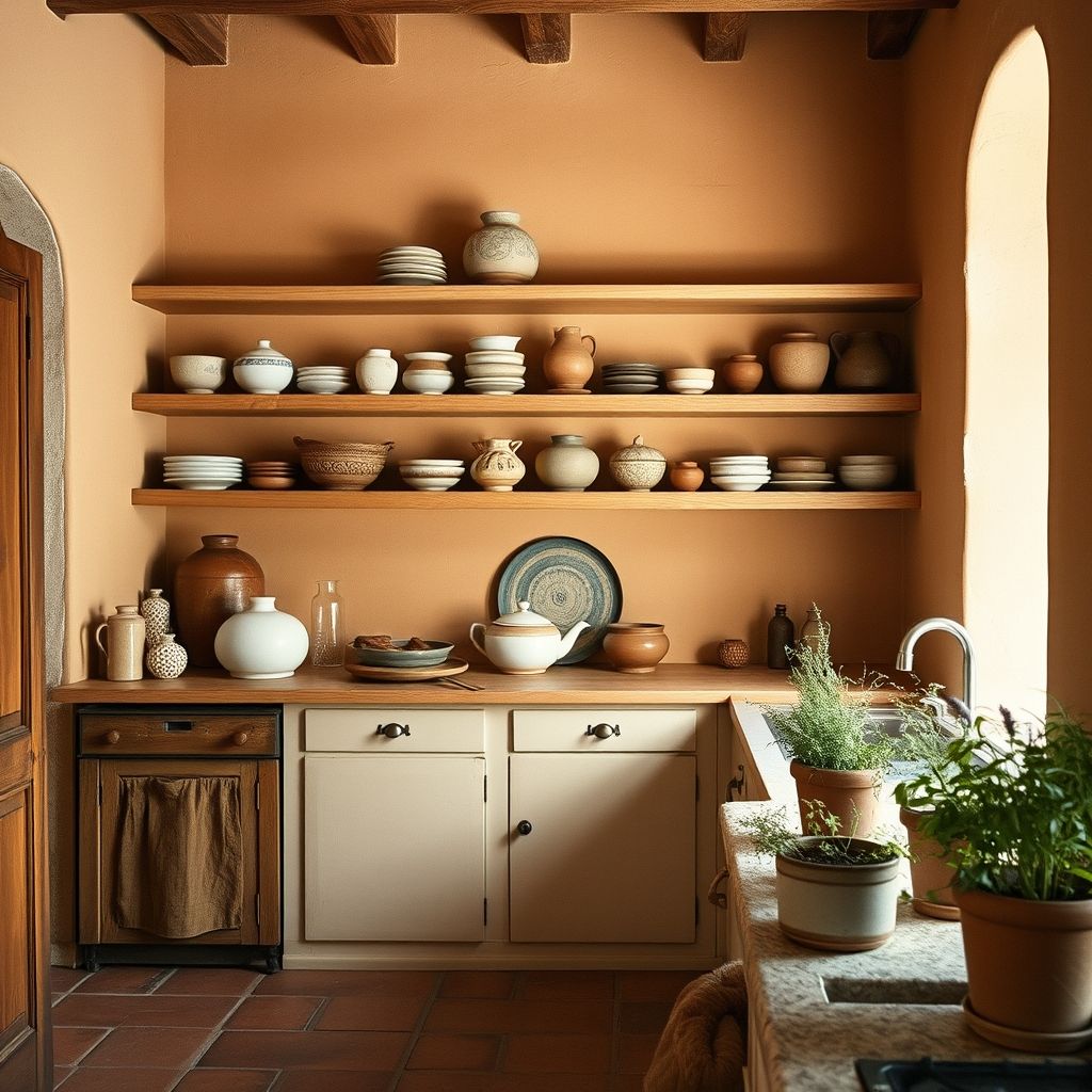
The tones that hold up over time come from the hills and the garrigue around the town. Terracotta, burnt ochre, olive green, clay, taupe grey and sandy beige make a soft, warm base. We steer clear of cold white and bluish greys that date quickly. To keep things fresh, we set these warm tones on lime walls, whose living surface catches the light without hardening it. A kitchen does not need ten colours. Two background tones, one stronger shade for the lower units and a livelier accent on a detail are usually enough. In Grasse, a slightly grey-green sage or a gentle ochre works as well in summer as in winter.
Materials that age well
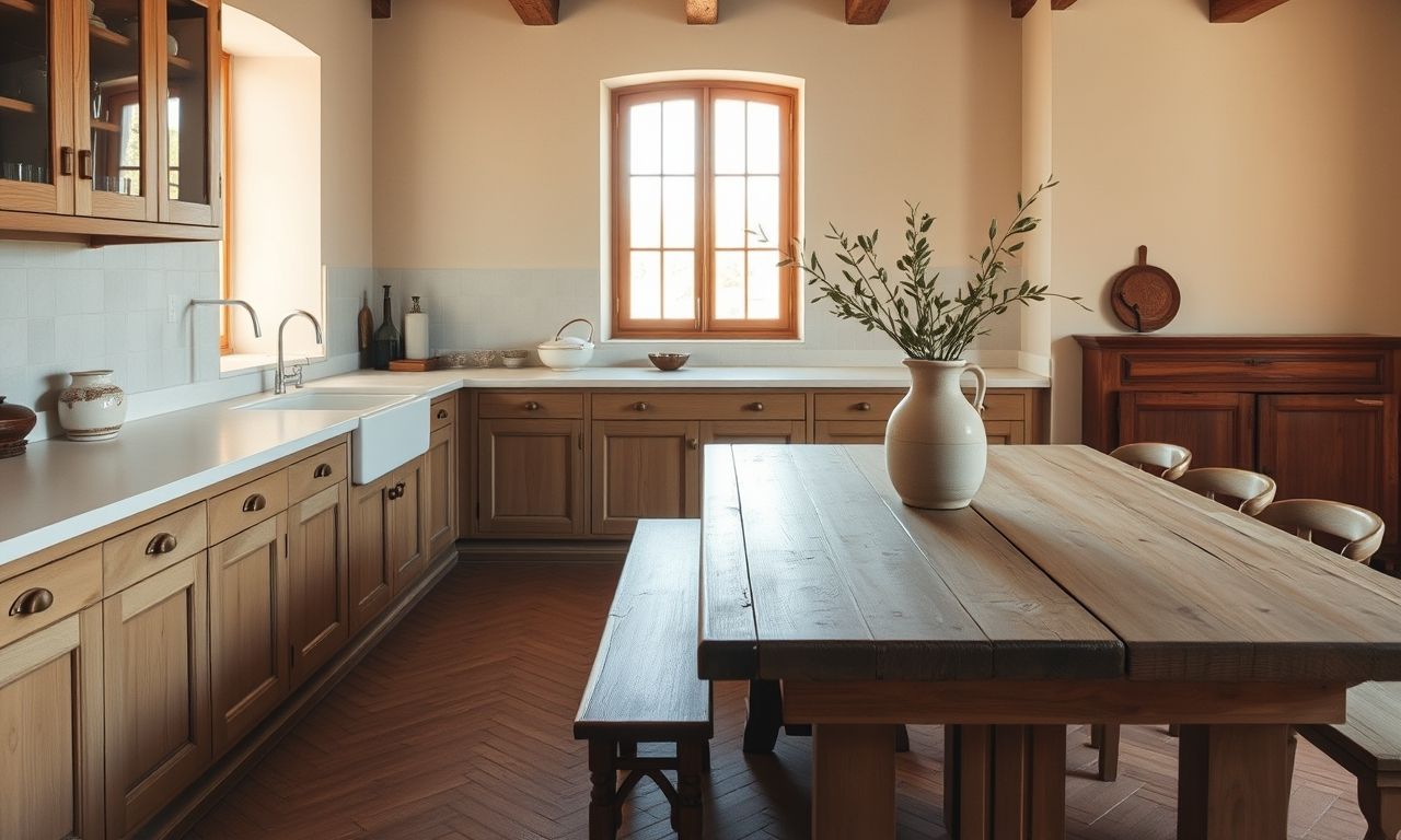
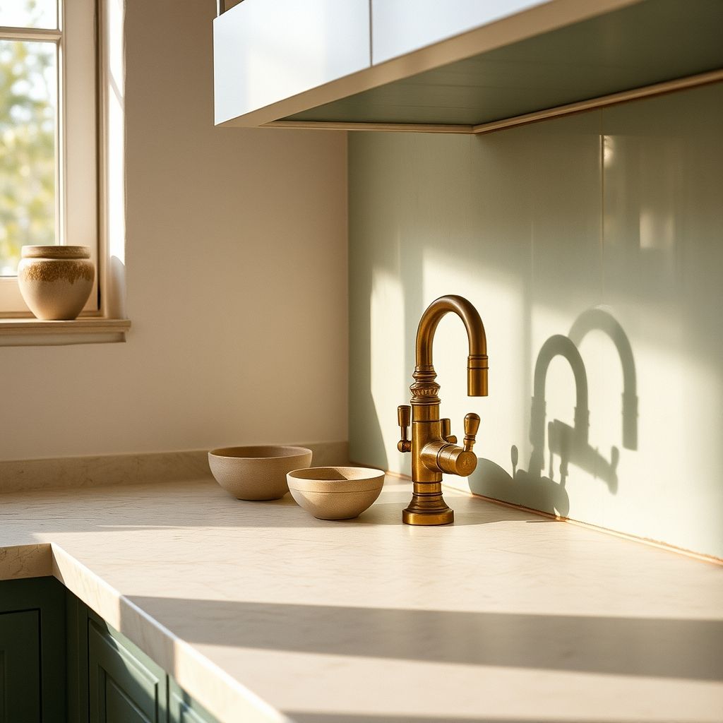
A kitchen is used every day, so we choose materials that take on a patina instead of wearing badly. Solid wood comes first. Pale oak, oiled oak and walnut bring a warmth that lacquered panels will never have. We like to leave them a little raw, with a matt oil finish that is easy to repair. Stone comes next, in travertine, local stone or veined marble for the finer surfaces. These materials take a fine patina and carry the passing of time. Metal, finally, does better kept quiet. Aged brass and satin bronze replace absolute black and sit better with warm woods. The idea is not to line up perfect materials but to bring together surfaces that gain character with the years.
The floor: terracotta tomettes and their alternatives
The floor sets the tone for the whole room. The Provencal tomette, in fired terracotta, stays our favourite. Its warm colour and small irregularities warm up a kitchen at once. Laid in a herringbone or staggered pattern, it gives the space structure with no rug or trick. When old tomettes are not possible, we turn to a porcelain stoneware that imitates terracotta, easier to maintain near the cooking zone. Pale stone works too, above all in slightly dark kitchens that need to bounce the light. We always keep a matt or satin floor, never glossy, to stay true to the spirit of the place. A floor that looks too new breaks the mood, so we prefer softened finishes that feel almost already lived in.