In Grasse, the light comes in from the hillside
Before talking about materials or colours, we always start by watching the light. In Grasse it has a character of its own. The town clings to the slope, shaded lanes open onto dazzling terraces, and the kitchens of older houses often receive a sideways light, filtered through foliage or a narrow courtyard. This indirect light flatters mineral tones and matte surfaces. It hardens cold whites and glossy lacquers, which throw back unkind reflections.
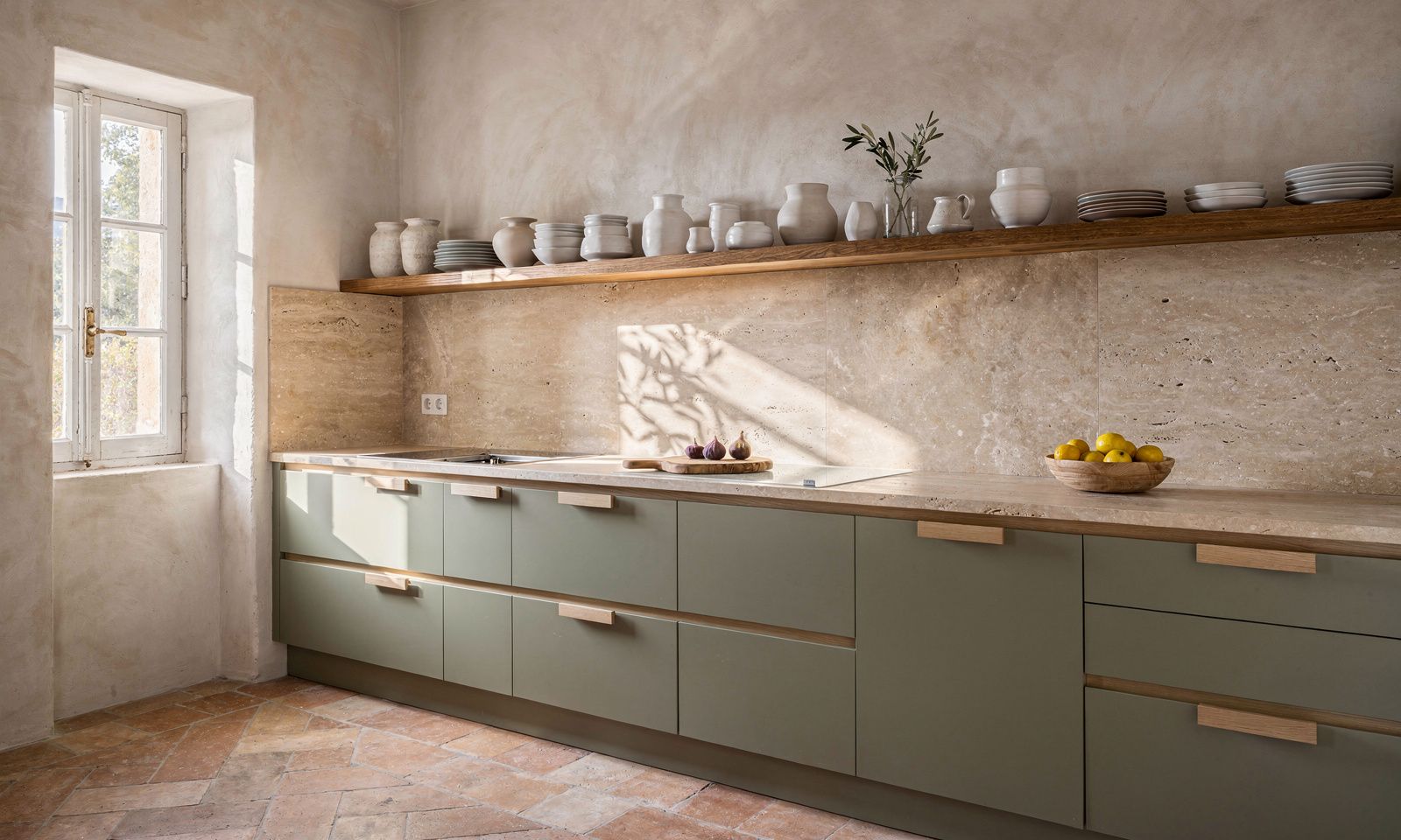
That is why the contemporary Provencal kitchen feels so at home here. Its sandy tones, greyed greens and pale stones absorb the light instead of bouncing it back. In the morning the room feels cool and calm. In the evening, as the sun drops behind the Tanneron hills, the same surfaces take on a golden warmth that no artificial lighting can imitate. When we work with a family in Grasse, we always spend time in the kitchen at different hours of the day. That simple exercise often settles the whole palette, long before any decision about fronts or flooring.
Travertine, the material that defines 2026
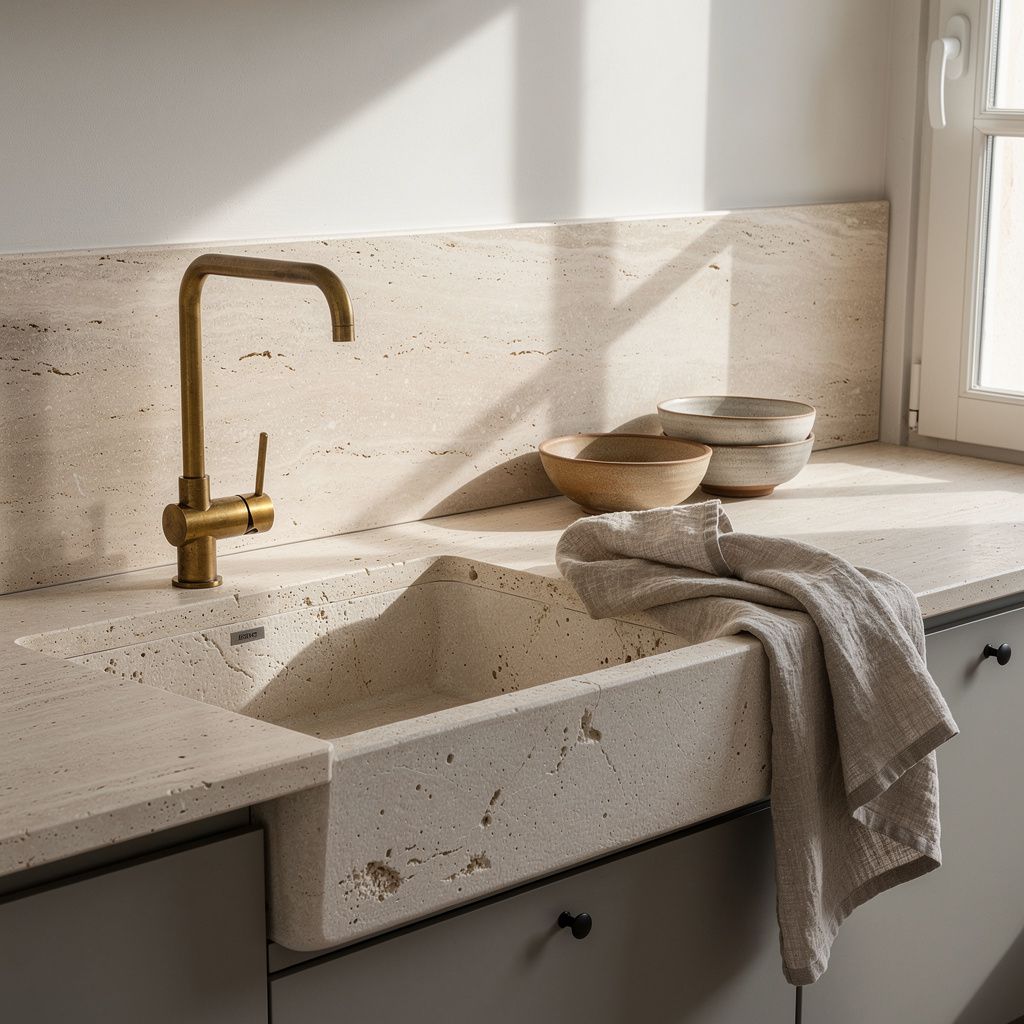
Travertine is making a remarkable return this year, and we are glad of it. This stone in sand and beige tones, marked by irregular veining, has exactly what the Provencal kitchen asks for, a gentle mineral presence without stiffness. As a honed matte worktop, a full height splashback or a simple shelf under a window, it brings a depth that composite materials struggle to match.
We love travertine for the way it ages. It develops a patina, it records years of family cooking, dishes set down in a hurry and summers when the house is full. For a Grasse home we recommend a honed rather than polished finish, closer to the touch of the stone fountains in the old town. It pairs with almost everything, the aged brass of a tap, handmade ceramics, the linen of a curtain under the sink. If the budget calls for restraint, a travertine splashback behind the cooking zone is often enough to set the tone of the whole room, with a quieter worktop in pale composite stone.
Sage green, the colour that calms everything
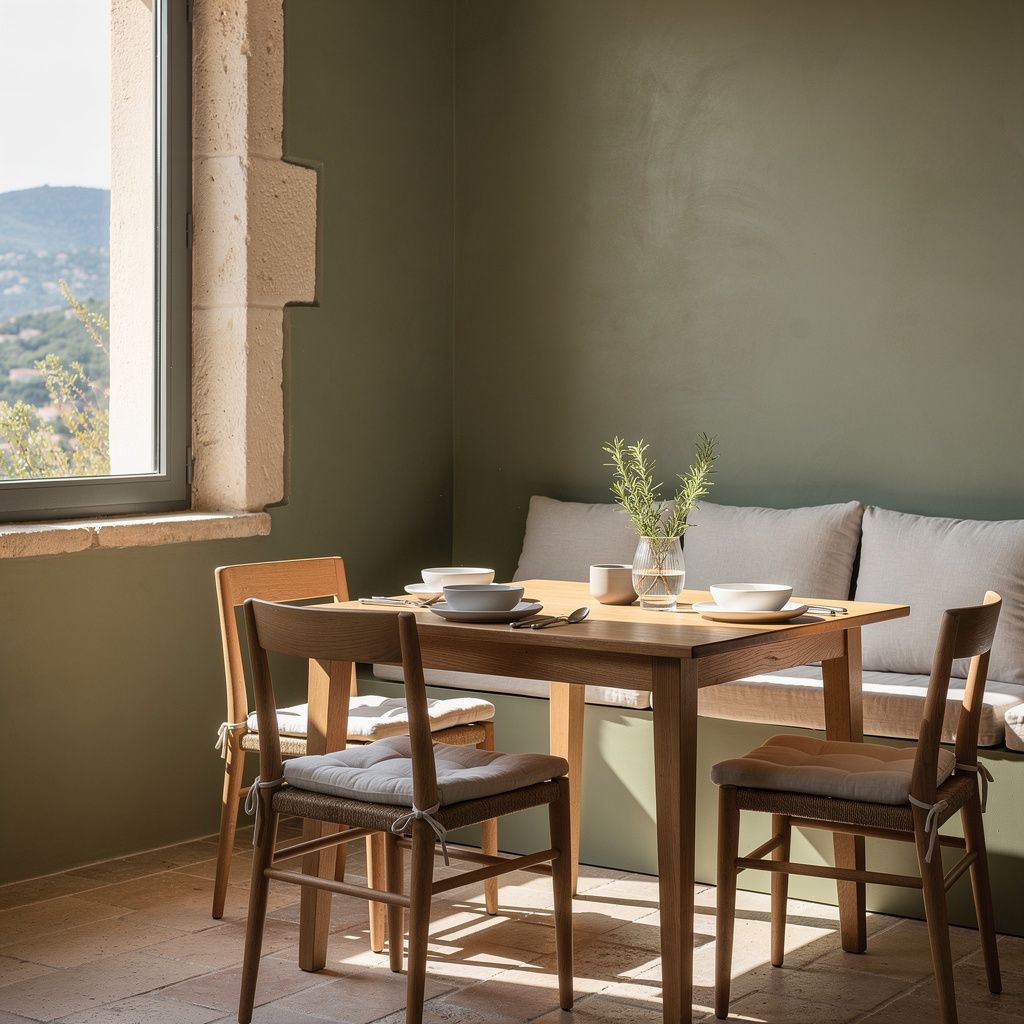
Among the shades of 2026, sage green stands out as the truest match for our hills. Neither cold nor sweet, this greyed green recalls the underside of olive leaves and the sage plants of dry gardens. In a kitchen it has a rare quality, it works as well with pale stone as with dark wood, and it holds steady under any lighting.
On cabinet fronts, sage green gives a quiet depth that white never reaches. On a wall, it wraps the dining corner and softens the sometimes awkward transition between worktop and table. We like to pair it with a pale ochre, a restrained terracotta or a sandy beige, the colours of the local earth. For those who enjoy contrast, a touch of walnut brown on a shelf or a chair anchors the whole.